Earth ScienceTactile Graphics
Teacher’s Guide
Catalog number 1-03131-00
Accessible HTML and BRF versions of this guidebook are available at www.aph.org/manuals/
Copyright ©2017 by the American Printing House for the Blind, all rights reserved.
Printed in the United States of America
This publication is protected by Copyright and permission should be obtained from the publisher prior to any reproduction, storage in a retrieval system, or transmission in any form or by any means electronic, mechanical, photocopying, recording, or otherwise. For information regarding permission, contact the publisher at the following address:
American Printing House for the Blind
1839 Frankfort Ave.
Louisville, KY 40206
800-223-1839
www.aph.org or [email protected]
Reference citation:
Otto, F. & Hoffmann, R. (2017). Earth science tactile graphics: Teacher’s guide. Louisville, KY: American Printing House for the Blind.
The project leaders thank the following teachers for their time, attention, and creative comments in evaluating Earth Science Tactile Graphics:
Nancy Arnold, Sandra Craig, Elizabeth Eagan, Heather Johnson, Jeff Killebrew, Tim Lockwood, Barbara Minkler, Rafeela Nalim, Amanda Ramirez, and Pamela Roberts.
Earth Science Tactile Graphics are raised-relief drawings depicting processes, concepts, and structures typically covered in middle and high school Earth Science courses. This collection serves as a reference volume that is intended to supplement, not replace, the graphics in a student’s classroom textbook.
These graphics may offer students a different look and feel from their adapted textbook graphics. The emphasis in this set is on tactual readability rather than adherence to a particular printed image. Because these graphics are not identical to any image found in a particular science text, they may not contain the same features as a given textbook graphic. Thus, these accessible graphics and the student’s textbook together make a good combination.
The drawings in Earth Science Tactile Graphics include many types of lines and textures, as well as surfaces of different heights. While it might seem preferable to give certain line types and textures the same meaning throughout the set, the limited selection of readable textures and the complexity of the graphics combine to make this goal impractical. As a result, lines and textures should be interpreted within the context of each diagram. This and other aspects of the tactile images require a certain amount of experience and interpretation skill on the part of the reader.
The braille labeling on the tactile graphics in this set is in Unified English Braille; Nemeth Code is used where appropriate. The begin and end Nemeth indicators are used for certain notations within a graphic or, in some cases, placed at the top and bottom of the graphic to indicate that the entire sheet is Nemeth labeled.
All of the drawings in Earth Science Tactile Graphics depict concepts, systems, or terms that are common to any basic course in Earth Science.
Instructional hints are given for many of the tactile drawings in the set. They focus on how you might present the concepts to students who are blind and what these students might find most challenging about these drawings or concepts. The goal of the suggestions is to help you as you try to make science learning meaningful for students who are not using the standard printed images.
It is rare to find a tactile picture that stands on its own for the blind reader to understand without context from the textbook or explanation from the teacher. Even the best crafted tactile graphic cannot overcome the fact that perceiving through touch is different from perceiving with sight, and things that are instantly apparent with sight are usually less apparent through touch. These graphics may help illustrate concepts in science just as print pictures do, but they always depend on the verbal description or physical demonstration that you provide to make them effective. In other words, the graphics don’t teach science concepts—you do!
Consider the range of pictures found in science books. They present front, side, overhead, and interior views, pictures of things real and conceptual, on a scale from the microscopic to the cosmic. With sight, one can look at a picture and instantly recognize the perspective—the essence of how the information is presented—and, within this context, quickly focus on details of what is being conveyed. Using touch, this immediate grasp of the whole of the picture is not available. The whole must be pieced together with time and exploration.
As a teacher, you can help students read a tactile graphic by explaining how the graphic is presented and what it shows, for example: “This shows the movement of solar radiation in the atmosphere as if we were looking at the Earth from just above the surface,” or “This is how the minerals in rocks look magnified thousands of times under a microscope.” These different kinds of views require explanation and demonstration, because, as stated before, it takes time and practice to translate the many ways things can appear to the sense of sight into a meaningful tactual experience. In some cases the titles of the images indicate the perspective (e.g., cutaway view), but it is always advisable to check on students’ understanding of the images and offer more context as needed.
Print graphics, and those in this set, show things from different perspectives. For instance, we can look down on the land from above, as if hovering over it, or we can look at the cross section of a volcano from ground level, seeing it sliced open from top to bottom. With exposure, demonstration, and practice, we gain the ability to interpret and connect these images to concepts we are familiar with. If students lack such exposure and practice, they will need some creative assistance from you to make these images “real.”
Many of the diagrams in this set contain arrows, which serve different purposes, depending on the context. Some arrows indicate the transition from one stage in a cycle to another, while others show the actual motion of one substance into or away from another. Students may need specific training in reading and interpreting arrows, depending on their previous experience with arrows in tactile diagrams.
Keep in mind that when you use these tactile graphics, you are not only teaching students Earth Science, you are helping them to use and interpret tactile pictures in general. As you build up students’ competence and comfort in reading graphics, you open up learning possibilities for them and prepare them for further academic success. Along the way, you will introduce many concepts and, with luck, stimulate students to be active and strategic thinkers (that is, scientists).
The following are brief notes on the tactile graphics in this set, giving some considerations that may be helpful in your teaching.
The arrows in the diagram indicate transitions from one state to another over very long periods of time. Two kinds of arrows are drawn to help simplify the clutter. The thicker (heavier) arrow lines indicate the standard cycle from one state through each of the other states; the lighter arrow lines indicate that rocks may change states by skipping over intermediate states under certain conditions.
These drawings of magnified samples illustrate, in a general way, the shapes and arrangements of mineral particles in the three types of rocks. Sedimentary rock typically has more rounded mineral grains; igneous rock often has sharper, angular particles; and metamorphic rock features compressed, sheet like forms. (Students should also understand that there is a great deal of variation within the types, especially in the size and density of the grains.)
This image shows a cross section of a type of soil with substantial A, B, and C horizons. Of course, the relative depths and components of these horizons vary greatly in different regions.
The upper part of the diagram shows how differences in the shapes of the fine particles composing soil affect the size of the pores created between the particles. The tactual differences in the two illustrations are subtle, but focusing on the spaces between particles shows the pores to be larger when particles are more rounded. This can be demonstrated easily by comparing a collection of angular blocks to a collection of balls and noting the corresponding spaces between items in each.
The cutaway views in this diagram give separate color and tactile treatment to the Earth’s core, mantle, and crust, ending with a view of oceanic and continental crust. The relative dimensions of the core, mantle and crust are accurate in the first three views.
In the lower right image, note the relative thicknesses of the continental crust and oceanic crust. This concept is important for understanding plate tectonics.
The image of Earth’s internal structure should be studied before this image, in order to introduce the concepts of the core, mantle, and crust. The arrows in this image do two things: They illustrate the circulation of relatively cooler and hotter fluid material in the Earth’s mantle, and they show the direction of forces which are exerted on the tectonic plates above, driving them together or apart.
An arrow also indicates how an upwelling between diverging plates can produce an oceanic ridge. Students need to understand that such a ridge, if viewed from above, could extend a great distance along the diverging plate boundaries.
You can demonstrate these different views by creasing a piece of paper into a tent shape. Ask students to examine just the edge of the folded paper first, which represents the cutaway view of the ocean ridge. Then ask them to examine the length of the fold from above, which simulates the overhead view.
Students can grasp the main idea of the theory of continental drift by comparing the clumped-up configuration of land masses in the first image with the spread-out arrangement in the last, even if they are not particularly fluent with reading world maps. The more experience students have had, however, the more they may pick up on details concerning the paths taken by different land masses and their changes in shape. Practice in reading world maps with a similar elliptical projection would be especially helpful.
Tactile point symbols are placed on three of the land areas as an aid to tracking their movements and changes from one image to the next.
This illustration relates to the previous one and again shows a long-ago grouping of land masses. It may be helpful to have students refer back to the previous illustration to see the present-day configuration after examining this image. First, students should be aware that not all the present-day continents are shown in this graphic.
Help students to identify the present-day continents by their labels and shapes, noting that long ago they were oriented differently than they are today. Then help students track the individual areas of texture or color crossing from one land mass to another. The line of reasoning for students is then to infer how the presence of certain fossil clues in different continents supports the theory of continental drift.
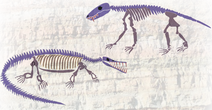
The fossils of the species referred to in Diagram 8 are shown here, giving an idea of the varying skeletal structures of the extinct animals and of the way in which fossilized plant forms typically appear. Two invertebrate species frequently found in fossil remains, the trilobite and the brachiopod, are also shown.
Although it is tempting to identify the vertebrate animals as dinosaurs, this is not the case. For the most part, these creatures predated the dinosaurs and lacked specific skeletal features that characterized the dinosaurs.
All the organisms shown are extinct except brachiopods, which still live today.
This chart illustrates the decay of radioactive parent material in rocks into inert daughter material over multiple half-lives. With each half-life the proportion of parent material is reduced by half.
This presentation of Earth’s geologic time scale gives students a tactual and kinesthetic exposure to the concept. Beginning at the center of the diagram, labeled 4,500, and tracking the dashed line in a spiral around the page gives students a physical experience of the duration of Precambrian time, a long period during which the fossil record reflects the relatively low abundance of simpler organisms that existed then. The Cambrian Explosion is represented at the point where the dashed line changes to solid; this marks the beginning of the Cambrian Period (542 million years ago). At this point and beyond, the fossil record is full of many different kinds of large and small complex organisms, much greater in abundance than in the eons that precede it.
Important events in the evolution of organisms are noted with dates along the spiral. For ease of reading, the geologic eras and periods are omitted, but consider asking your students to identify and label these positions on the spiral after they have become familiar with the information given.
The island model is presented as a tool for students to learn some basic terms related to landforms.
You may use this model to illustrate these (and possibly other) features:
The points labeled A and B on the landform map serve as reference points for use with the topographical or topo map, as do the gray contour lines. While examining the topo map, students may refer back to the landform map to correlate the abstract information on the topo map with a tangible model.
The topo map diagram introduces several challenging concepts. First, students should learn that the contour lines represent places of similar elevation, and that they always enclose an area. Each new contour line signals a change in elevation of some regular amount (in this case, 250 ft) from a neighboring line. When contour lines bend outward, it signifies a hill, and when lines bend inward, it signifies a valley. The small tick marks inside the blue-colored area on the topo map symbolize a depression or basin. Referring back to the landform model, students may try to infer what is represented when contours are close together (rapid change in elevation) and when they are farther apart (gradual change).
To understand the profile diagram below the contour map, students must imagine slicing the landform open along a line running between points A and B. It may help them to fix a string or rubber band between A and B on both the landform model and the topo map. Each place where line A-B intersects a contour line corresponds to an end of one “layer” in the profile diagram.
At a basic level, the profiles show how one’s vantage point changes the view of the landscape. Students should imagine standing at the level of the water and looking at the island from a distance, with A on the left and B on the right. From this vantage, one cannot see the whole island the way one could from above; rather, one sees a profile. For students who are blind, tracking along a string from A to B can help simulate this view.
The “view” obtained by tracking from A to B would be something like the A-B profile view shown: The ground rises at a steep but even rate, then reaches a relatively wide peak, and then slopes more gradually down to the right before becoming steeper toward the shore.
A different impression of the land is formed if the profile is taken between C and D. Viewed from the side or tracked from C to D, the land rises less evenly, forms a narrow peak that is steepest on the left side, and falls much more gradually on the right with a wide plateau midway down.
With practice, map readers can obtain all this information just from the topographical map by interpreting the shape and spacing of the contour lines. Thus a topo map may be as informative as a much bulkier relief map or land model.
Several of the landform features found on the island model may also be seen on this model, but with different names. When formed by glacial action, a mountain peak is called a horn, a basin becomes a cirque, a ridge is called an arête, and a valley may become a trough or U-shaped valley.
The upper section of the model shows the landscape with the masses of glacial ice, which should be understood as slowly and constantly moving. The lower section shows the effects of the glacier after it has moved or melted away. To be more accurate, the lower image would have to show a deep, rounded valley carved out by the main trunk of the glacier. The hanging valleys perched above it would typically have waterfalls plunging into the glacial trough.
Students should imagine that the layer of glacial ice shown at the top edge once covered the whole area shown. The graphic now depicts the glacier retreating, after having created or deposited the various features indicated. The textured surface of the whole area represents glacial till, or rocky debris deposited by the glacier.
The volcano diagrams contain similar features, so apart from their shapes it may require some study to note their differences. A shield volcano is formed by repeated effusive outpourings of lava, flowing from underground and hardening in successive layers into a low dome. The cinder cone contains ash and cinders, and because of its explosive formation, it is built up higher. The composite volcano has elements of the other two, being both effusive and explosive, and its successive layers are composed of lava and rock. The composite volcano diagram also shows a side vent and, although it is not labeled, an illustration of a sill. (These are shown and labeled in another diagram.)
Note that the size of the volcanoes and the distance between the magma chamber and surface in these images are not drawn to scale. Features have been compressed or exaggerated to better illustrate these elements.
The first three stages in this process diagram show the effects of the magma chamber growing underground: first, the crust bulging upward over the magma chamber; second, the crust breaking apart from the pressure; and third, the resulting fissures filling with magma, which further breaks the crust and vents gas and lava. In the last stage, the magma chamber which previously had been growing is depleted, and without the upward support the magma provided, the crust above sinks into the chamber. The result is a basin at the top of the volcano where once the ground was raised high.
When the volcanic activity in an area ceases, the previously fluid magma can harden. Excavating the area can reveal large hardened masses, or batholiths, as well as dikes (vertical and upward columns of hardened lava going through horizontal layers of rocks) and sills (hardened lava along or between layers of rock). The image also shows an outpouring of hardened lava at the surface, called a flow.
The first image introduces the terms hanging wall, footwall, and fault plane. Students should understand that the fault plane is not an object but a fracture between rock layers that runs at an angle to the surface. It may be helpful to model this concept using two stacks of paper or books to represent the rock layers on either side of the fault, then relating your model to the cross-sectional view given in the tactile image. It may also help to think of a hanging wall as having a ledge that one could hang on, and a footwall as looking something like a foot.
The bold arrows represent forces working to move the rock masses apart or together. The thinner arrows show the direction of movement. The last image switches to an overhead view to show two areas sliding past each other with no change of elevation between them. The matching edges of the colored “basin” in each area show that the two areas were previously aligned.
Geologic folds are often compared to the folds formed in a rug that has slid on the floor and been pushed up against a wall. The effect is a series of wrinkles in a previously flat surface. The upper image shows how these folds are classified depending on whether they are rising (anticline) or dipping (syncline).
The right side of the image also shows that rising and dipping folds of rock do not always correspond with peaks and valleys on the surface, respectively. Erosion, deposition, and other forces can alter the surface in ways that differ from the pattern of folds below.
The angular unconformity image shows that erosion and deposition of new rock may occur on top of older folded layers. The effect is that some layers (such as layer 4) appear interrupted and others end abruptly (layer 5). If students start at the surface on the left side and move a finger straight down, as if drilling down through the layers, they will pass through a different series of rocks than if they drill down at the center or at the right side.
The illustration of convection currents (Image 6) shows how movements of magma in the Earth’s mantle may push the overlying crust together or apart. Wherever tectonic plates are spreading apart, magma can flow freely upward between them, leading to the formation of oceanic ridges or rift valley features.
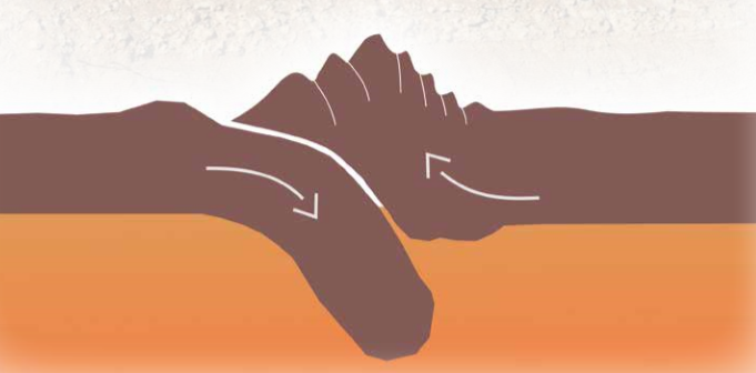
When plates are converging, one of the plates will typically be forced downward under the other. Subduction is illustrated in each of the three convergent plate images. The third image also illustrates the folding of mountains resulting from the uplift as one area of continental crust collides with another.
Although the outlines of the tectonic plates are the most tactually prominent features of this image, students will probably have more success interpreting it if they focus first on the low, solid surfaces of the land masses. Help students to recognize that the map is a standard rectangular projection of the world and to use prior knowledge to identify the continents. After students have become oriented in this way, the plate outlines will be placed in a meaningful context.
This map has a similar presentation to the Tectonic Plate Boundaries (Image 25). Once students have identified the land masses, they should be able to compare the two images and form ideas about the relationship between plate boundaries and volcanic/seismic activity.
Only the processes involved in the water cycle are labeled in this diagram. As the pictorial elements of each stage are not labeled, offer students help in recognizing the images of trees, clouds, mountains, and so on. Note, too, that the ground is shown in cutaway view.
A texture is used to represent the water-permeable areas of rock underground, while the impermeable areas and bedrock are shown as smooth and solid. The water table, which is the upper range of the saturated zone, is shown as a dashed line.
The artesian well is shown spouting water at the top. Students may need help interpreting this visual convention, which is used here to distinguish the artesian well (which spouts due to underground pressure) from the ordinary well (which must be pumped mechanically).
These images illustrate ways to control the effects of water and wind on soil erosion. In each one, the green, textured areas represent sections that have been plowed and planted with crops.
The two images on the left show techniques used on sloping land and therefore have both an overhead and a profile view. The tactile features are subtle, so you may help students by pointing out that terraced land has been plowed to form flat “steps,” while contour planting retains the original slope of the land but makes planted rows perpendicular to the slope. In both cases, farmers avoid creating rows that run downhill, which would speed the runoff of soil.
On the right, the top image represents a planted field with trees or hedgerows surrounding it to reduce the effects of wind on the soil. At the bottom, the illustration shows strip cropping, which involves alternating rows of a desired crop with rows of soil-holding or soil-building crops.
This is a simplified process diagram showing the movement of different forms of carbon through various systems. Students should understand that the image represents the ground below (cutaway view) and the atmosphere above.
Like the Carbon Cycle diagram (Image 30), this image shows the ground (Earth) at the bottom and the atmosphere above, but with a much broader view that includes the Sun and space outside the atmosphere.
Coming out from the Sun is a wide band representing a quantity of solar radiation directed toward Earth. As it contacts Earth’s atmosphere, some is reflected and some enters to be absorbed by the planet’s surface. Heat is then emitted from the surface, some of which becomes trapped in the atmosphere by greenhouse gases and some of which escapes into space. The narrowing of the wide yellow band indicates the dissipation of the original solar radiation through these various processes.
The atmospheric concentration of carbon dioxide is represented here by a wide blue band. The width of the band indicates a range of values, as the concentration rises and falls regularly in 6-month intervals. While there is considerable variation in the global temperature from year to year (as represented by the thin red line), students can see that the overall trend is upward and correlates with the trend in carbon dioxide levels. (Note: This diagram is labeled in Nemeth Code.)
This map introduces the symbols used on weather maps to show frontal systems. Students should understand that these are to be seen as moving; that is, they represent a dynamic weather pattern in a general way.
The numbers on this map represent temperatures, and the dashed lines are isotherms, which enclose areas with temperatures within a given range (in this case, every 10 °F).
This image offers some opportunities for students to supply missing information. In the first case, the label for one of the isotherms is missing. Ask students what the label for that line should be (40 °F).
The isotherms have been left off of the lower part of the map to give students an opportunity to add them on their own. Ask students to examine all the temperatures shown and decide if other isotherm lines are needed. Students may use waxed string or drafting tape to make their own lines to enclose areas with similar temperatures.
The lines on this map enclose areas with similar barometric pressures, given in millibars. Isobar maps may be very complex and crowded with information; this one is greatly simplified to introduce the concept.
As with contour maps, students should note that when lines are closer together it signifies a more rapid change in values over a smaller area. In terms of weather, this signifies either a high or a low pressure area forming.
The first diagram is a set of circle graphs comparing the atmospheric composition of the four innermost planets.
The second image gives cutaway half-circle views of the internal structures of these planets, with their relative sizes accurately represented.
Although the exact proportions and components of the outer planets are speculative, this image shows the features of the so-called “gas giants” as currently understood. The relative sizes of the planets are accurately shown, and a circle representing the size of Earth is included for context.
The H-R diagram is unusual in a number of ways. Although it resembles a coordinate graph, it is really more of a chart showing stars at various stages of their life cycles. Note that the scales on each axis are not linear (the units do not increase in a regular manner). It also has the unusual feature of showing the higher values at the left of the temperature axis rather than the right.
The numbers on the vertical axis represent luminosity relative to our Sun. Given that our Sun has a luminosity of 1 and a temperature of about 5,800 Kelvin, students can try to identify a dot matching these values, which represents the Sun. (Using a straight edge will be helpful for this task.)
(Note: This diagram is labeled in Nemeth Code.)
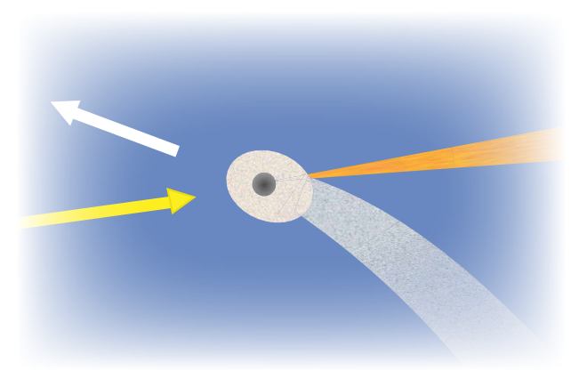
Students should understand that a comet orbits the Sun in an elliptical path, so its position relative to the sunlight is always changing. Thus, while the dust tail will always trail out behind the comet as it moves, the ion tail (pushed out by the solar radiation or solar wind) will always be in line with the Sun.